Coffee Shop Re-brand
I started off not knowing much about package design; all I knew was that packages were created to sell items on the shelf. I hadn’t given much thought to why I bought products or how I was influenced by certain package designs, including colors, textures, shapes, sizes, and more.
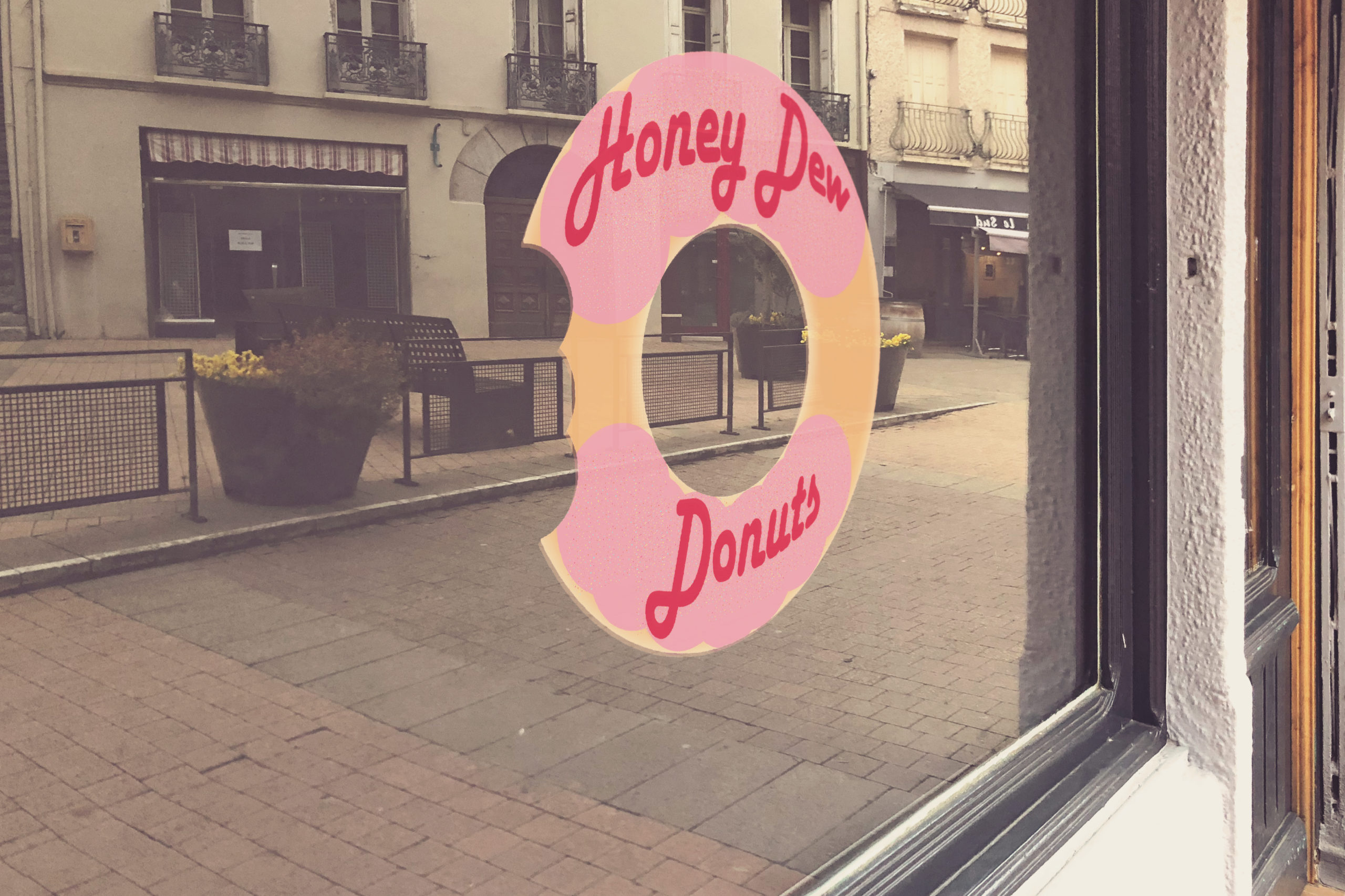
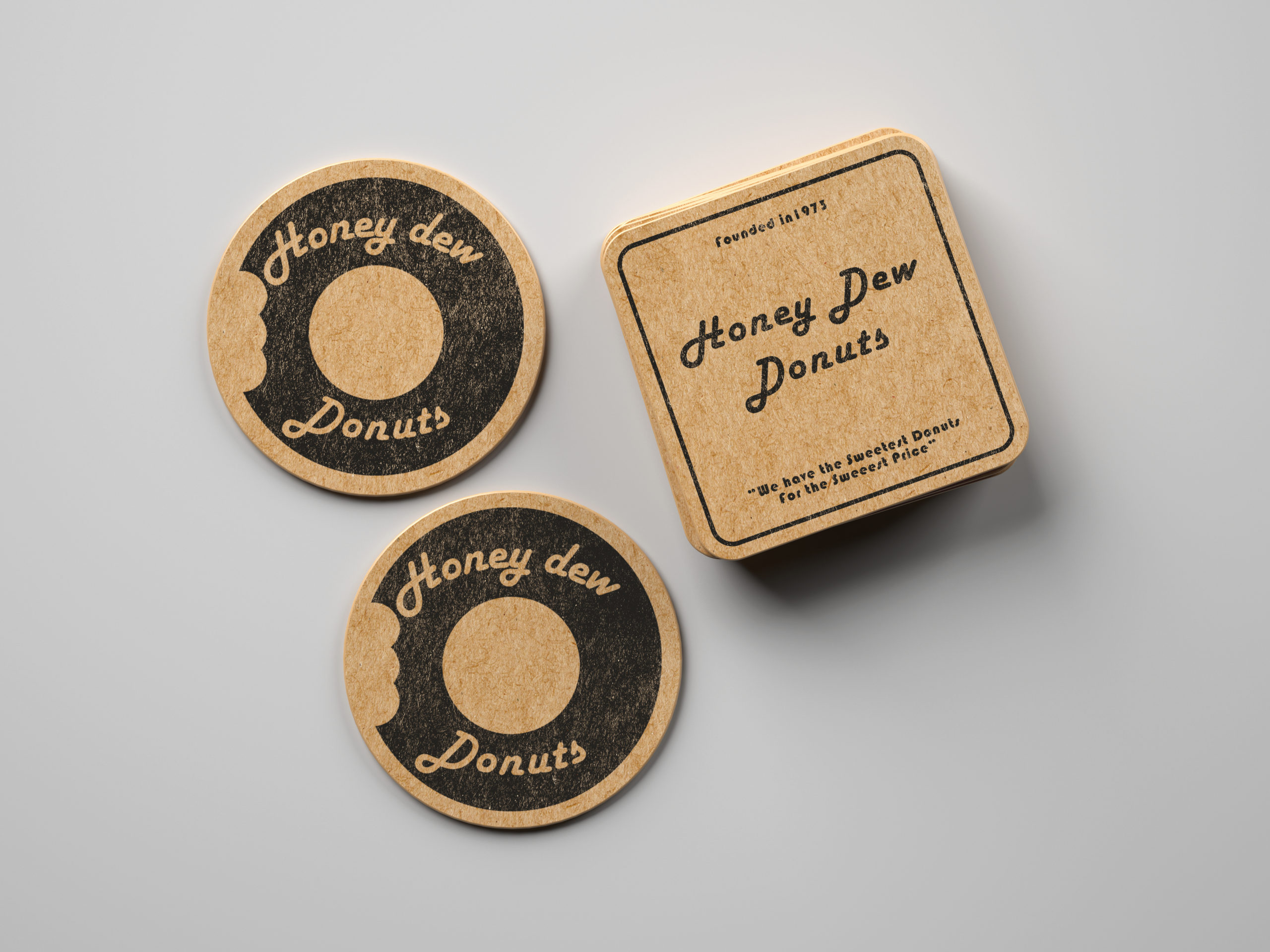
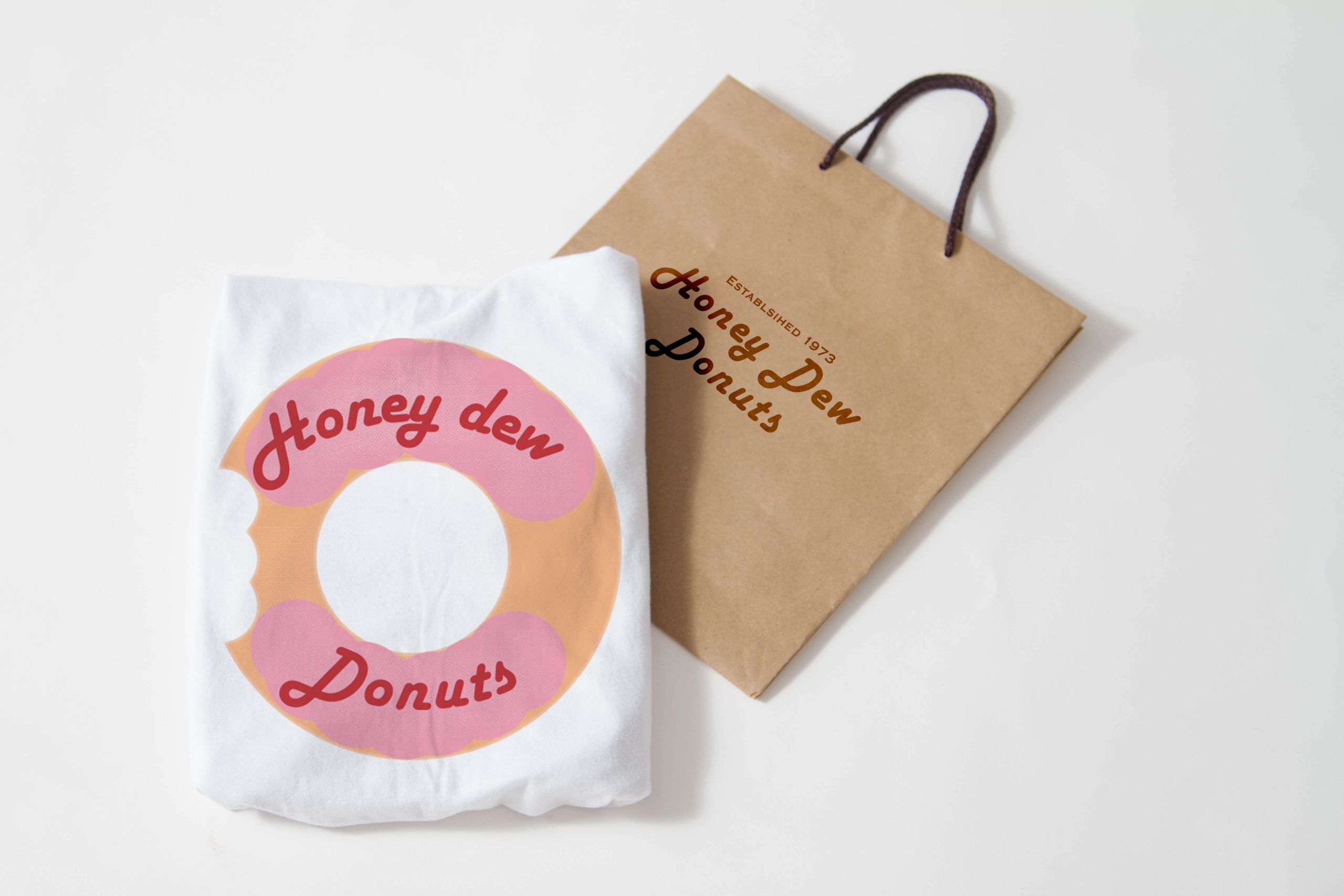
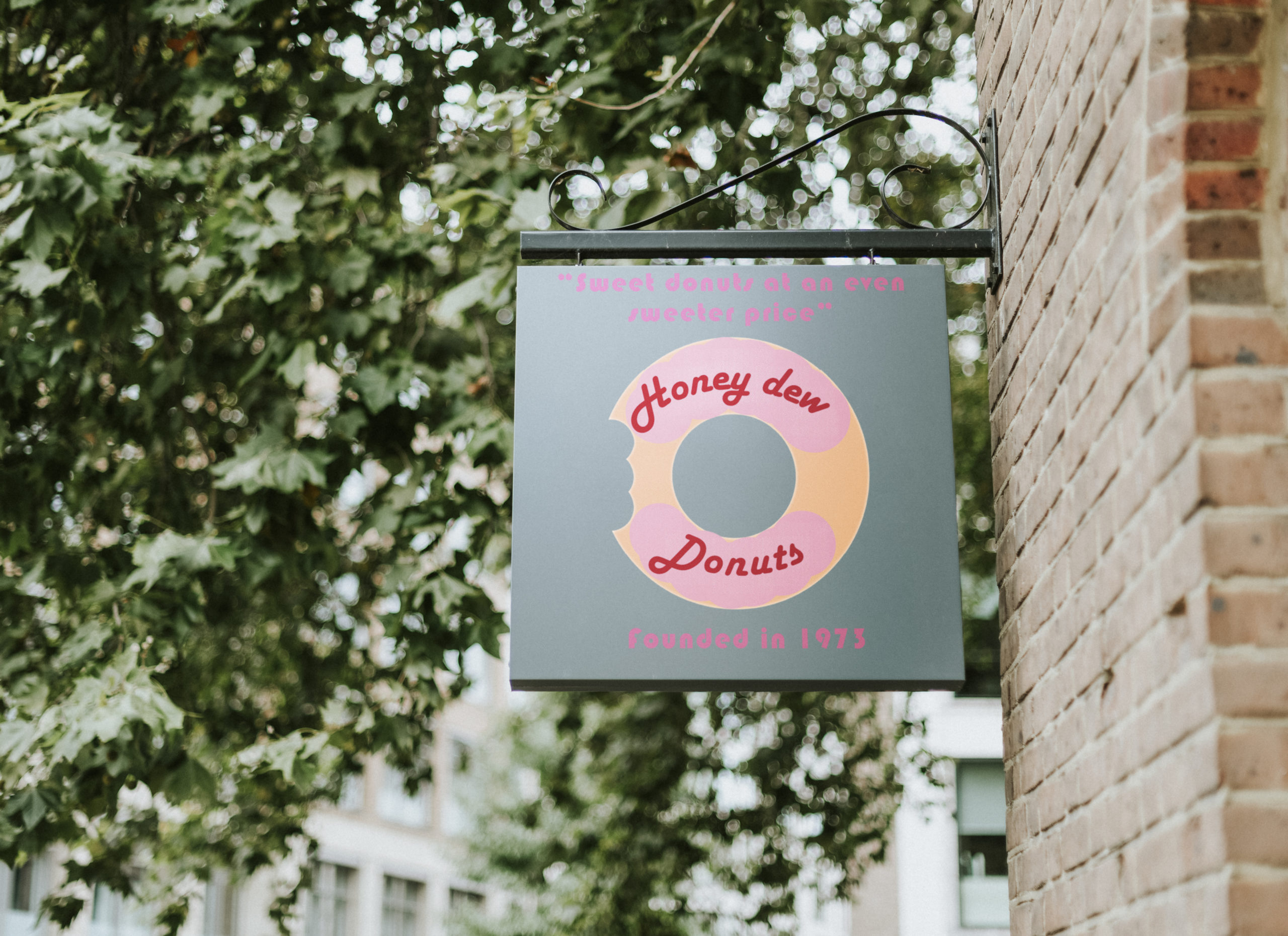
The challenge I faced was to rebrand a local coffee shop by improving their logo and enhancing their value proposition. I had to come up with a new and improved logo design and apply it to different package design mockups, including a coffee bean pouch, a coffee cup, a coaster, a sign, and a t-shirt. To be successful in this assignment, it required thinking like a consumer and considering what would appeal to someone as they drive by a coffee shop or grab a coffee cup to start their morning.
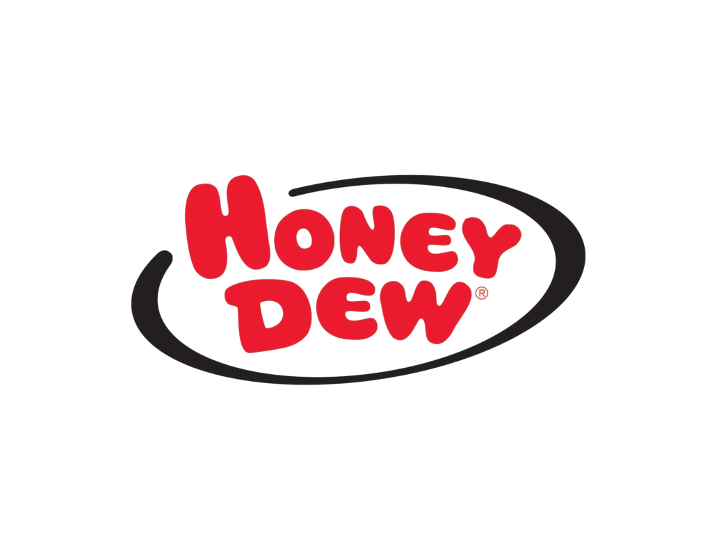
I chose Honey Dew Donuts for my coffee shop rebrand. Founded in 1973 by Richard J. Bowen, Honey Dew Donuts has been a staple coffee and donut shop in New England for many years. The original logo features the word “Honey Dew” in red and a half-closed oval with donuts in black at the bottom. Although this current logo has become iconic, it has its limitations, and I knew I could improve upon it significantly. The impression I get from looking at the Honey Dew logo is more of a novelty store than a store that sells coffee and donuts.
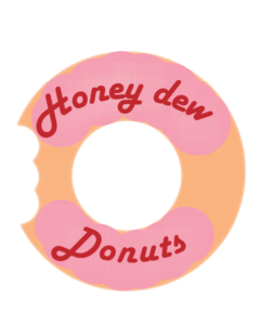
When coming up with a logo design, I aimed for something modern, yet simple enough and large enough to be clearly readable at a smaller scale. Honey Dew’s main selling point has always been their donuts, which is the most prominent part of their current logo, so I thought incorporating a donut into the logo design would appeal to a wide range of people and accurately represent what Honey Dew is best known for.
Original Logo vs Re-Branded Logo